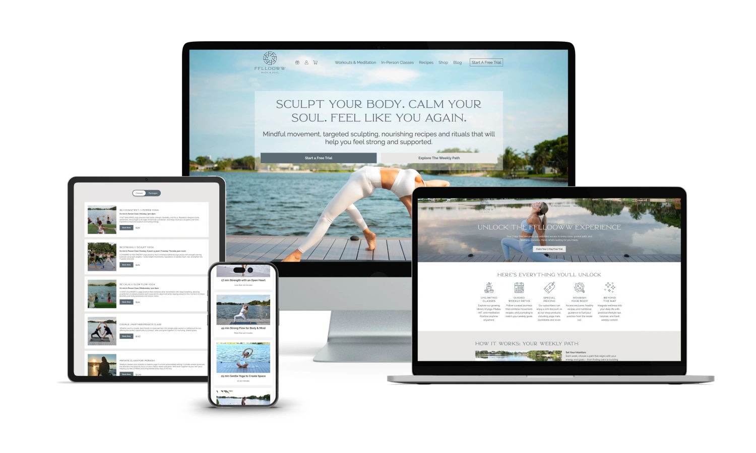
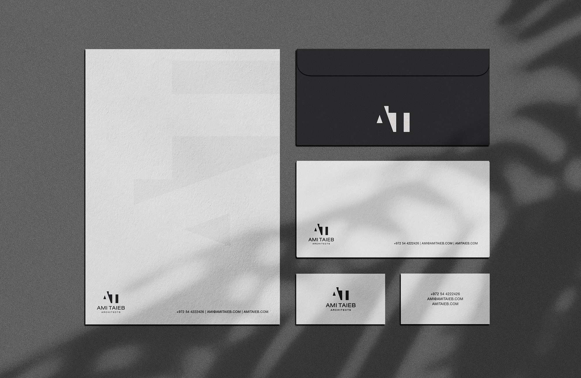
Minimalist design is everywhere, but most of what people call minimalism is really just emptiness. A clean layout can feel premium, confident, and modern. It can also feel vague, cold, or unfinished if it removes the information users actually need.
At Ulisses – the creative powerhouse owned by award winning designer Uriya Ganor – we have spent 20 years building brand identities and websites that stay clear under pressure, across audiences, and across devices. In our experience, minimalist web design works when it is a system: deliberate hierarchy, readable typography, intentional whitespace, and content that earns trust.
This guide shows how to do minimalism without losing personality, meaning, or conversions.
A Practical Guide to Minimalist Web Design
Minimalism works best when it is a disciplined system that highlights value, not an excuse to remove meaning.
What Minimalism Really Means in Web Design
Minimalist web design is not about using fewer elements. It is about using fewer competing elements. The goal is clarity: one main message, one clear path, and a visual language that supports easy scanning. A minimalist site can still be rich in content, storytelling, and brand personality. The difference is how that content is organized. Minimalism prioritizes structure over decoration, and intent over trend. You keep what helps users decide, and remove what distracts them from deciding. This approach is especially powerful for premium brands, SaaS, and service businesses, because it reduces noise and increases perceived confidence. But it only works when the essentials are strong: positioning, copy, and visual hierarchy. If those are weak, the minimalist style will amplify the weakness instead of hiding it.
Use Hierarchy to Replace Visual Noise
When you remove decorative elements, hierarchy becomes your main tool. Users need to know what matters first, second, and third without guessing. Start with a clear headline that states the outcome, not the category. Add a supporting line that answers who it is for or why it matters. Then place one primary call to action that is visually dominant. Use typography size, weight, and spacing to create a strong rhythm. Keep your grid consistent, and avoid sudden layout changes that break scanning patterns. In minimalism, small inconsistencies feel bigger because there is less to distract from them. A good test is the five second scan: if someone can name the offer and the next step after five seconds, the hierarchy is working. If not, you need stronger structure, not more graphics.
Whitespace Is a Tool, Not a Style
Whitespace is often misunderstood. It is not wasted space, it is functional space that improves comprehension. Whitespace separates ideas, reduces cognitive load, and makes interfaces feel calmer. It also increases perceived quality, because generous spacing signals confidence. But too much whitespace can create distance, especially if the message is not strong enough to carry the page. Use whitespace to group related items and to create breathing room around your most important elements: headline, proof, and primary CTA. Set a spacing scale in your design system so margins and paddings feel consistent across pages. This is where minimalism becomes maintainable. When spacing rules are clear, new sections can be added without breaking the vibe, and the site stays coherent even as content grows.
Typography Does Most of the Heavy Lifting
In minimalist web design, typography is the voice. If the type system is bland, the brand will feel generic. If the typography is too experimental, readability will suffer. Choose a font family that fits the brand personality and performs well on screens. Then define a hierarchy with clear roles: H1, H2, H3, body, captions, labels, and buttons. Keep line length controlled so paragraphs are easy to read, and use line height that feels comfortable on mobile. Avoid ultra light weights for body text, and make sure contrast is strong enough for real world lighting. Typography also creates brand texture. Small choices like letter spacing, headline weight, and the balance between serif and sans serif can add character without adding clutter. When typography is intentional, you can keep the layout simple and still feel distinctive.
Minimal Visuals, Stronger Imagery Rules
Minimalism does not mean no images. It means images must earn their place. Use visuals to clarify, prove, or guide, not to fill space. If you use photography, set a consistent style: lighting, framing, and subject matter. If you use illustration, define rules for line weight, color usage, and tone. Mixed styles create noise quickly. Product screens, mockups, and diagrams can be especially effective in minimalist layouts because they provide concrete proof. But keep them aligned with your grid and spacing system so they feel integrated, not pasted in. Also watch file size and performance. A minimalist site that loads slowly feels like a contradiction. When imagery is consistent and purposeful, the design stays quiet while the story stays strong.
Content Is the Make or Break Factor
Minimalism exposes weak content. If your headline is vague, there is nothing else to carry the page. If your proof is missing, the clean layout will feel like an empty promise. Start by tightening your positioning: what you do, for who, and the outcome you deliver. Then build a simple story: problem, solution, proof, process, and next step. Use short sections with clear subheads so the page stays scannable. Add proof early, not only at the bottom. Proof can be client logos, testimonials, metrics, awards, or short case snapshots. In a minimalist layout, even one strong testimonial can outperform a wall of text because it is easier to absorb. Also be careful with jargon. Minimalism is about reducing effort, and jargon increases effort. The cleaner the design, the more your words need to be specific and human.
Minimal Design Can Still Convert
A common fear is that minimalist pages will not convert because they feel too restrained. The truth is the opposite when the fundamentals are right. Minimalism can improve conversion by reducing distractions and guiding attention. The key is to make conversion elements obvious and reassuring. Your primary CTA should stand out through contrast and placement, not through gimmicks. Use microcopy to reduce hesitation, like “Takes 2 minutes” or “No spam.” Keep forms short and label fields clearly. If you remove navigation for focus, make sure the page still answers key questions so users do not feel trapped. Add an FAQ section when objections are predictable, and keep it tight. Minimalism also works well with sticky elements, like a subtle sticky CTA, as long as it does not block content on mobile. Conversion comes from clarity and trust, not from visual clutter.
Common Mistakes That Make Minimalism Feel Empty
The most common mistake is removing information instead of removing noise. Users still need context, proof, and a clear path. Another mistake is relying on trendy layouts without a strong grid, which leads to alignment issues that feel sloppy. Teams also overuse light gray text and tiny font sizes, which looks elegant in mockups but fails in reality. Finally, many brands forget consistency across pages. Minimalism needs strict rules for spacing, typography, and components, or the site will feel inconsistent fast. If you want a minimalist look, invest in the underlying system. Minimalism is not the absence of design. It is design with fewer excuses.
Minimalist web design done right feels calm, confident, and easy to use. It highlights what matters, removes friction, and makes your brand feel intentional at every touchpoint. When you pair strong hierarchy with readable typography, purposeful whitespace, and content that proves value, less really does become more. If you want a minimalist website that still feels distinctive and converts, Ulisses can help you build the strategy, brand identity, and UI system that makes simplicity work – led by Uriya Ganor and backed by 20 years of global experience.