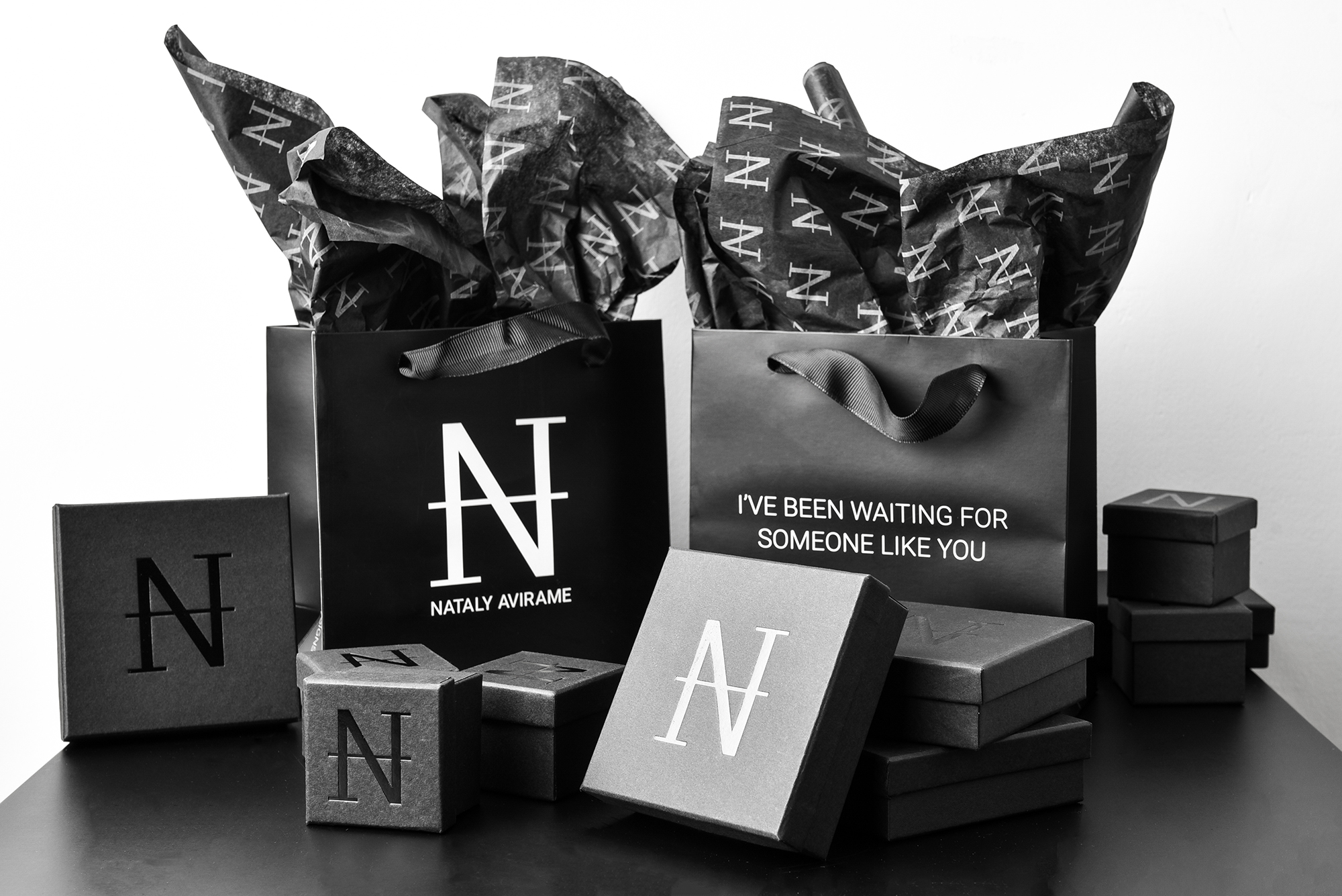
Most brand guidelines fail for one simple reason: they are written like a museum label, not a working tool. Teams open the file once, copy the logo, and never return. Then the drift begins – new decks use random colors, landing pages invent new button styles, and writers change terminology from page to page.
At Ulisses – the creative powerhouse owned by award winning designer Uriya Ganor – we have spent 20 years building brand systems that stay consistent across global teams. The difference is usability. Real brand guidelines make daily decisions easier. They reduce guesswork, protect brand identity, and help marketing and product UI feel like one experience.
This post shows how to build brand guidelines that are practical, searchable, and easy to maintain as you scale.
How to Build Brand Guidelines Your Team Will Follow
Brand guidelines should feel like a playbook, not a lecture. If the rules are clear and the examples are ready, consistency becomes the default.
Start With the Decisions People Make Every Week
Before you write anything, list the moments your team repeatedly faces. These moments are your table of contents. For example, someone needs to create a new landing page, write a product tooltip, build a pitch deck, or design a social carousel. If your guidelines do not answer those real questions, they will not be used.
A practical first list usually includes:
-
Which logo file should I use, and where can I place it?
-
What are the exact brand colors, and when do I use each one?
-
Which font styles are allowed for headings and body text?
-
What does our tone sound like in marketing vs support?
-
How do buttons, forms, and UI components look and behave?
When you structure guidelines around decisions, adoption improves because the doc solves problems instead of adding them.
Keep the Core Document Short, Then Link Out
Small teams often try to cover everything in one long PDF. The result is a document nobody can scan. Instead, create a short core guide that fits the essentials, then link to deeper pages for details. Think of it as layers.
A good pattern is:
-
Core guidelines: rules, examples, and quick do and do nots
-
Asset library: logo files, templates, components, and exports
-
Extended references: full design system, writing templates, and campaign examples
This keeps the main guide lightweight while still supporting advanced needs. It also makes updates easier, because you can refresh one page without rebuilding the whole document.
Define Brand Foundations as Roles, Not Just Styles
Foundations are the rules that make the brand recognizable across formats. The biggest mistake is listing colors and fonts without roles. Roles explain how to use each element with purpose.
Include these foundations:
-
Typography roles: H1, H2, H3, body, captions, labels, buttons
-
Color roles: primary action, secondary action, backgrounds, borders, highlights
-
Spacing principles: a simple scale and a few layout rules
-
Imagery direction: photography style, illustration style, cropping, tone
-
Icon style: stroke weight, corner radius, filled vs outline usage
When roles exist, people stop guessing. A primary action color becomes the button color everywhere. A headline style becomes consistent across pages. That consistency improves trust because users can predict patterns and move faster.
Connect Brand Identity to UI Components
Many brands look strong in marketing and weak in product UI. Users notice the gap, especially during onboarding, checkout, and account moments. Your brand guidelines should include basic UI rules, even if you also have a full design system.
At minimum, specify:
-
Button styles and states: hover, focus, disabled, loading
-
Form styles and validation: error, success, helper text
-
Links and navigation: active states and hierarchy
-
Alerts and banners: info, warning, error, success
-
Tone for microcopy: labels, empty states, confirmations
This is where brand guidelines become a real business tool. When product and marketing share the same typography logic, spacing rhythm, and tone, the brand feels stable across touchpoints.
Document Voice and Terminology Like a UX Team
Brand voice is not only for blog posts. It shows up in UI labels, error messages, and support replies. Add a voice section that people can use quickly. Keep it simple: three traits, tone by context, and vocabulary rules.
Include:
-
Three voice traits with do and do not examples
-
Tone map for marketing, product UI, and support
-
Preferred terms and avoided terms
-
CTA language rules, like verb first or outcome first
-
Formatting rules for numbers, dates, and prices
Consistency in terminology is a quiet conversion booster. When users see the same words for the same concepts, they feel less friction and more confidence.
Add Templates That Make Compliance Easy
Rules alone are not enough. Templates turn rules into speed. Provide ready assets so people can create on brand work without rebuilding from scratch.
High impact templates include:
-
Slide deck cover and section layouts
-
Landing page section blocks with headline and CTA patterns
-
Social post grids and typography presets
-
Email signatures and outreach formats
-
Case study page structure and proof blocks
If the easiest option is the on brand option, your guidelines will actually work. Templates also help new team members contribute fast without constant review cycles.
Use a Simple Table to Clarify What Goes Where
A small comparison table can prevent a lot of confusion, especially around tone and channel choices.
| Channel | Primary goal | What must stay consistent |
|---|---|---|
| Website pages | Clarity and conversion | Typography roles, CTA style, core message |
| Product UI | Task completion | Components, microcopy tone, error language |
| Sales deck | Fast understanding | Story flow, proof points, brand colors |
This table helps teams understand that consistency is not identical visuals everywhere. It is the consistent application of roles, voice, and system logic.
Build a Review and Maintenance Rhythm
Guidelines drift when nobody owns them. Assign one owner who curates updates and answers questions. Then add a lightweight maintenance rhythm that fits real work. A simple approach is to review guidelines after any major project, like a website launch, a product redesign, or a new campaign template set.
Your rhythm can be:
-
Quarterly: audit key pages and product screens for drift
-
Monthly: update templates based on what the team shipped
-
Ongoing: add rules only when a repeated question appears
The goal is to keep the guide alive without turning it into a bureaucracy. When updates happen in small increments, the system stays relevant and trusted.
Common Mistakes That Make Guidelines Useless
A few patterns show up again and again:
-
Too many pages, not enough examples
-
Rules that sound subjective, like “keep it modern”
-
No source of truth for files and templates
-
No guidance for UI states and microcopy
-
No owner, so updates become political
Fixing these is mostly about clarity. If you can show one good example and one bad example, the team understands instantly. If you can link directly to the correct assets, execution becomes effortless.
Brand guidelines are not a branding deliverable. They are an operating system for how your company communicates and designs. When the guide is built around real decisions, layered for speed, connected to UI components, and supported by templates, your team stops reinventing the brand every week. That stability makes the work faster and the customer experience calmer. If you want brand guidelines that hold up across web, product, and global teams, Ulisses builds practical systems that people actually use – led by Uriya Ganor, shaped by 20 years of international work, and designed to scale with your next stage of growth.