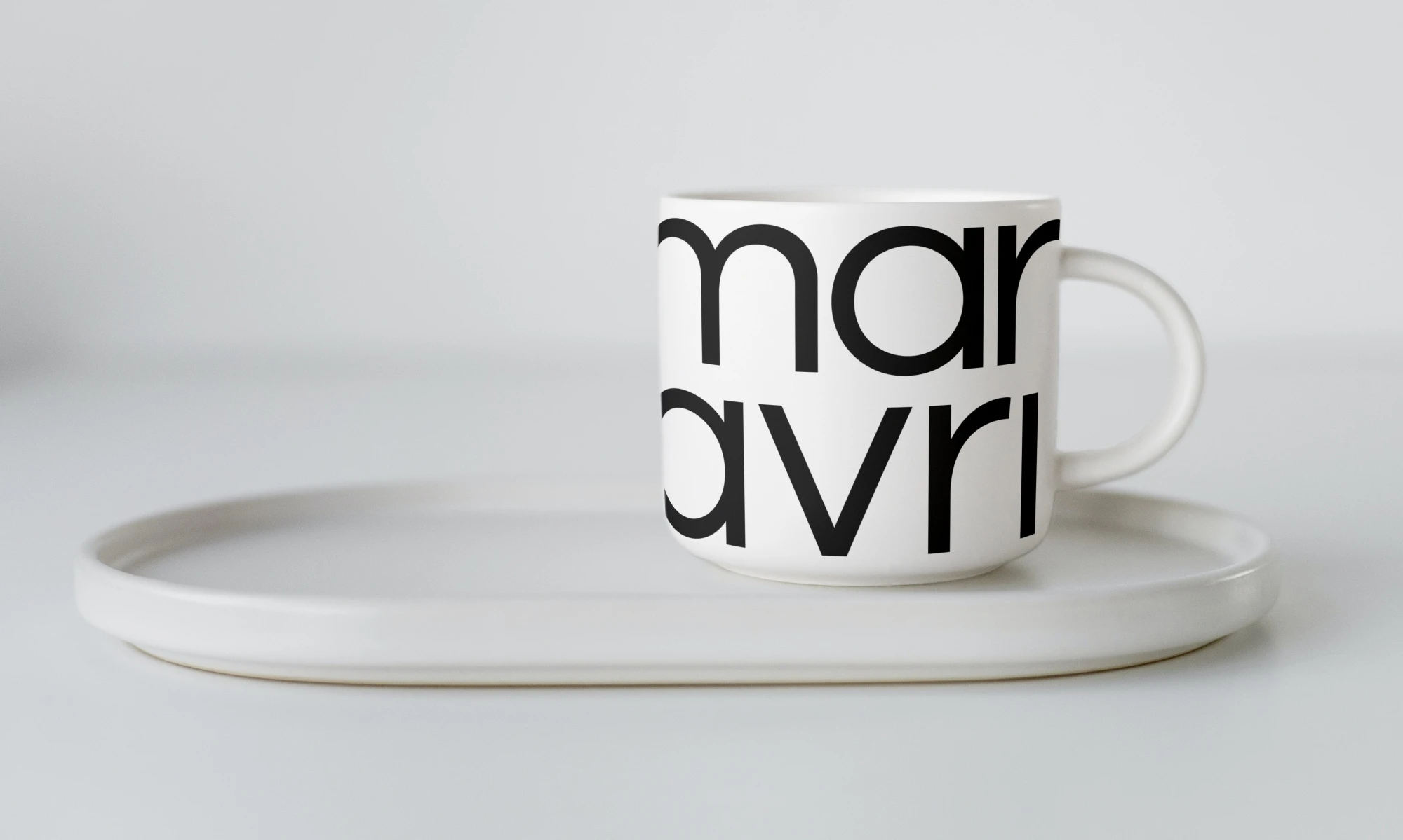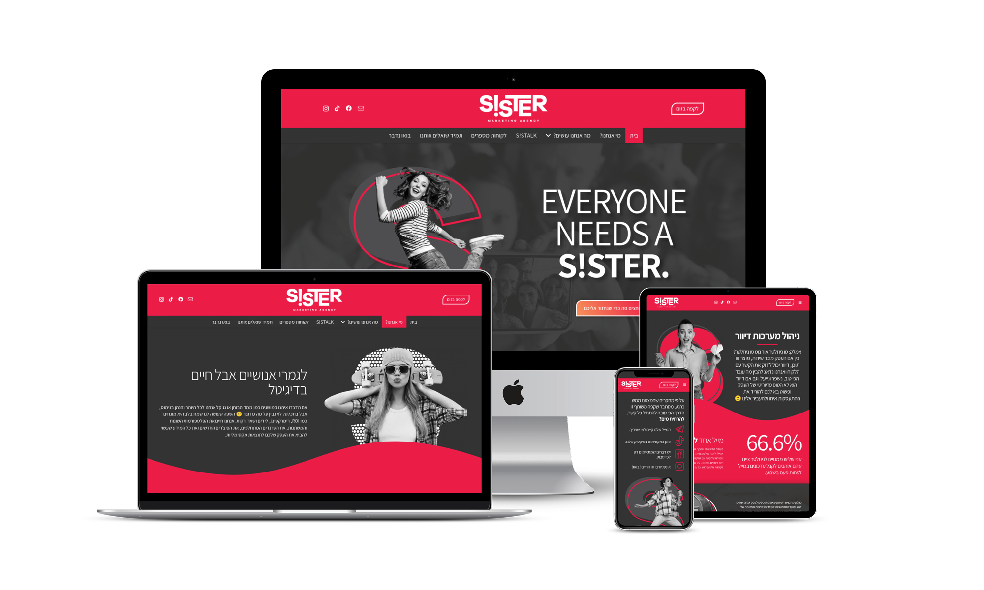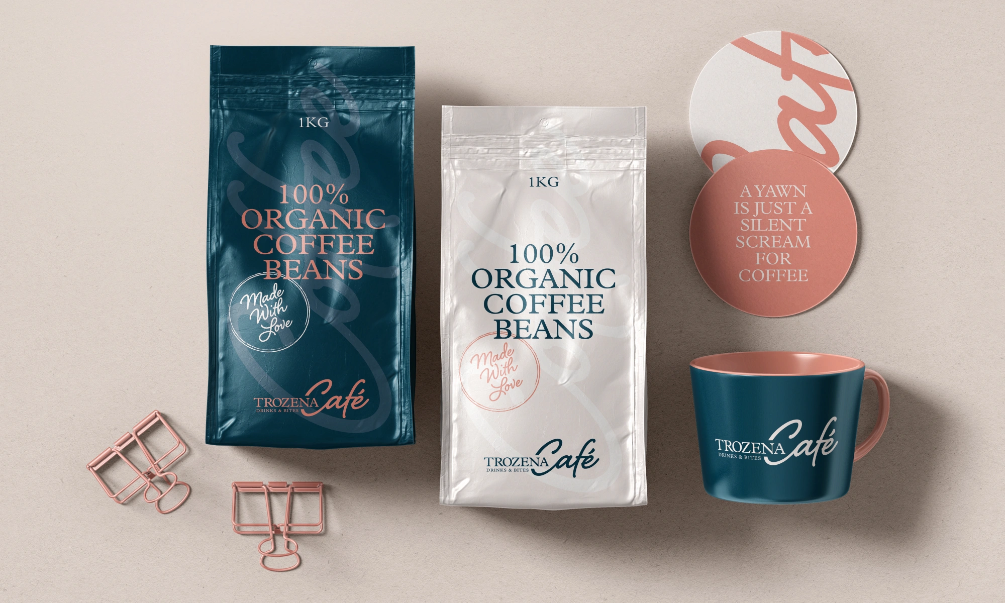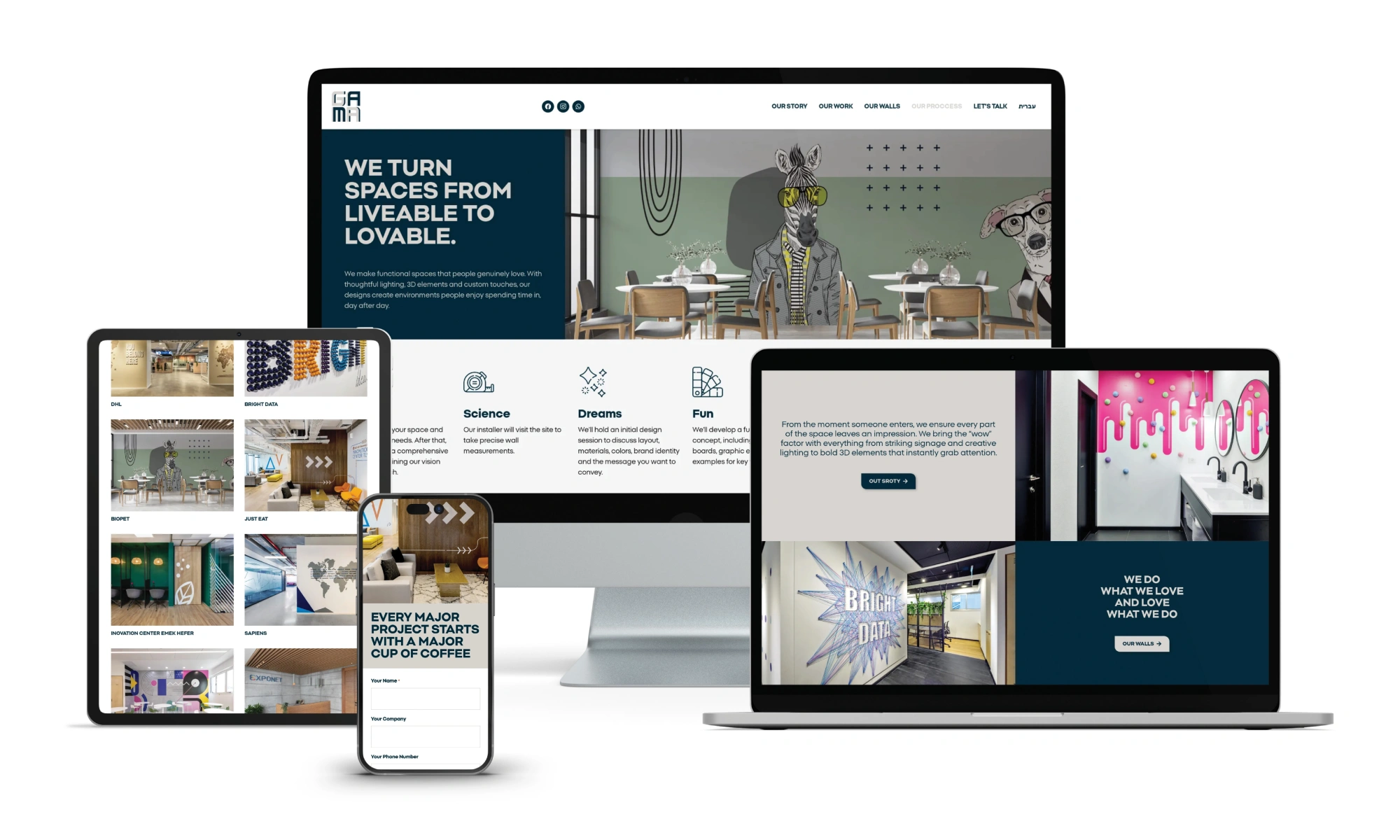
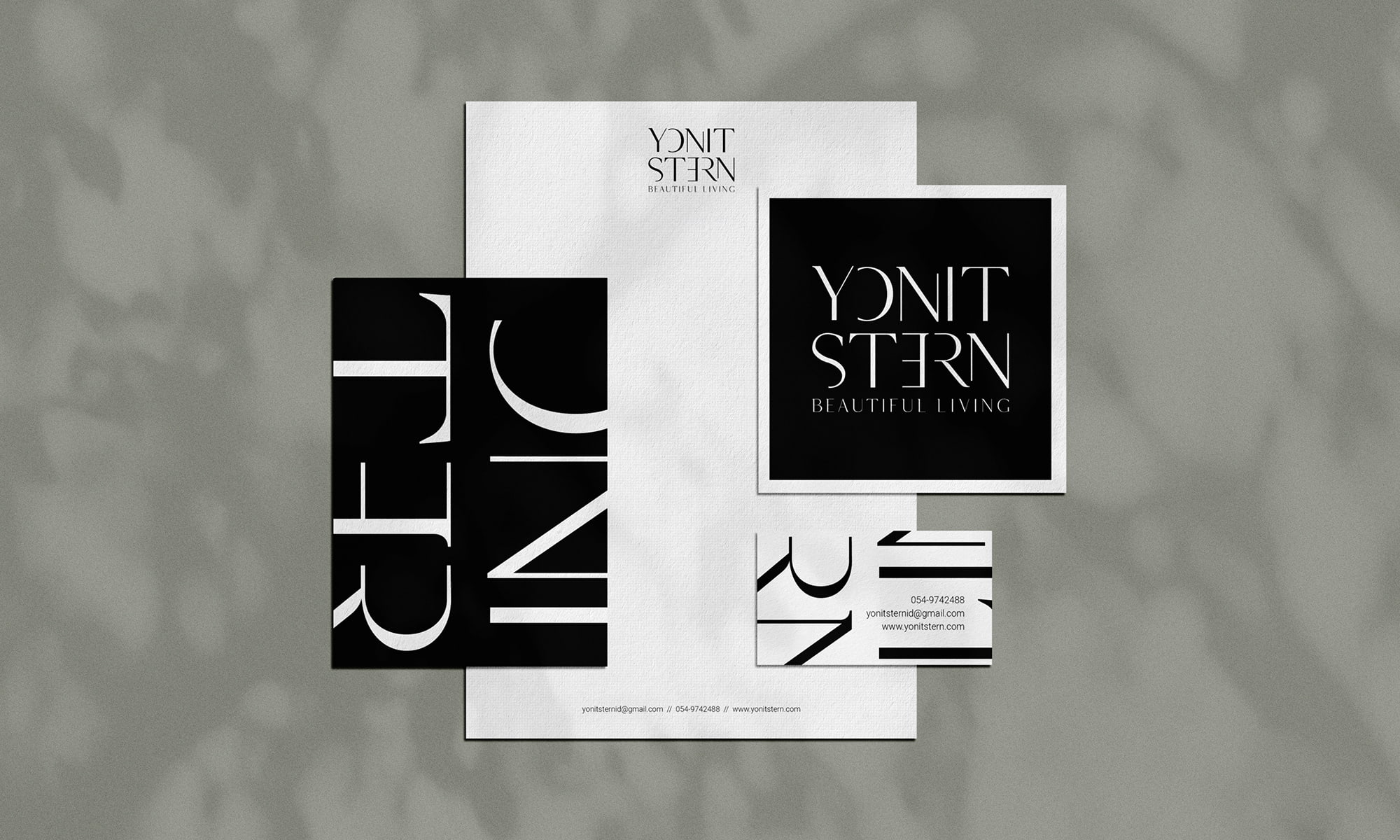
Typography is one of the fastest ways people judge a brand, even before they understand a single sentence.
The right type choices make a website feel confident, clear, and easy to use. The wrong ones add friction, reduce trust, and quietly hurt conversions. At Ulisses, the creative powerhouse owned by award winning designer Uriya Ganor, we treat UX typography as both a branding tool and a usability system. Fonts are not decoration – they are structure. They guide attention, set tone, and shape how quickly users can scan, understand, and act. This post breaks down practical typography decisions that improve readability, strengthen brand identity, and support better UX across marketing pages and product interfaces.
Why Typography Impacts Conversions
Most users do not read websites line by line. They scan for meaning, then decide whether to commit. Typography controls that scan. When headings are distinct, spacing is comfortable, and body text is readable, users find answers faster. Faster answers reduce anxiety, and reduced anxiety increases action. Typography also communicates credibility. A polished type system signals that a brand pays attention to details, which makes pricing, security, and claims feel more believable. On the other hand, inconsistent font sizes, weak hierarchy, and cramped line spacing create the feeling of clutter. Even if the content is strong, the presentation makes it feel harder than it should be. Good UX typography removes effort, and effort is the silent cost that blocks signups, inquiries, and purchases.
Start With Readability Before Personality
Personality matters, but readability is the baseline. If body text strains the eyes, the brand loses. Start with a typeface that renders well on screens and has strong character support. Then define body size and spacing that work across devices. For most websites, body text often performs well around 16 to 18 pixels on desktop, with line height that gives each line room to breathe. Avoid extremely thin weights for long text, especially on light backgrounds. Keep line length under control, because very wide paragraphs slow reading and make users lose their place. Readability is not a single setting – it is the result of size, weight, contrast, line height, and layout working together as one system.
Build a Clear Typographic Hierarchy
Hierarchy is how users understand what matters first. The goal is to make structure obvious without forcing it. Start by defining roles, not random sizes: H1, H2, H3, body, small text, captions, buttons, and labels. Each role should have a clear visual difference. If H2 and H3 look similar, scanning becomes guesswork. Consistent hierarchy also supports SEO because headings describe content sections in a predictable way. A simple hierarchy improves team efficiency too. When writers and designers share the same rules, pages come together faster and look cohesive even when multiple people create them. A practical approach is to define a scale and stick to it, then adjust only when there is a strong reason, like accessibility or dense UI screens.
Choose Fonts That Match the Brand Voice
Typography is part of brand identity, so font choices should support the personality you want people to feel. A modern tech brand might lean toward clean, neutral sans serif type, while an editorial brand might use a serif with more contrast and character. The mistake is choosing a font only because it is trendy, or because it looks good in a logo mockup. Test fonts in real layouts: navigation, hero headlines, long paragraphs, pricing tables, and forms. A font that looks great in a headline can fall apart in small sizes or on mobile. Also consider tone. Rounded forms can feel friendly. Sharp details can feel precise. Wide letterforms can feel premium, but they may take more space in UI. The best choice is the one that supports both voice and function.
Pair Fonts Without Making It Complicated
Many teams pair two fonts, one for headings and one for body. That can work, but it should not become a styling project. The easiest path is to start with one strong family that includes multiple weights, then build contrast using size and weight. If you do pair fonts, aim for clear contrast, not small differences. A common pattern is a distinctive headline font with a neutral body font. Keep the pairing disciplined so your website does not look like it was assembled from different templates. Limit the number of font families, and keep the number of weights reasonable. Too many variations slow performance and create inconsistency. A good pairing system makes designers faster and helps users feel stability as they move through pages.
Set Rules for Spacing, Not Just Fonts
Typography is not only letters. Spacing is what makes type readable. Define line height for each text role, and set margins for headings so sections feel organized. Pay attention to vertical rhythm, the consistent spacing pattern that keeps layouts calm. For UI, avoid tight spacing in labels and form fields. Users make more errors when text is cramped. Also set consistent letter spacing for all caps labels and buttons, because all caps can become harder to read without adjustments. Finally, do not ignore contrast. Light gray text on white can look elegant in a mockup, but it often fails in real conditions. If users need to squint, they will leave.
Make Typography Work Across UI and Marketing
A brand often looks strongest on marketing pages and weakest inside product UI. That gap hurts trust. Users should feel like they are still with the same company when they move from a landing page to a dashboard, checkout, or onboarding flow. The fix is a shared type system. Define a common scale that works for both content heavy pages and dense interfaces. Create rules for buttons, navigation, table headers, and helper text. Keep microcopy consistent with your brand voice, but prioritize clarity. In product UX, words should be direct and reassuring. Avoid clever phrasing that adds ambiguity. At Ulisses, we connect typography decisions to component libraries so every screen inherits the same logic automatically.
Accessibility and Performance Are Part of UX Typography
Good typography includes users with different vision, devices, and environments. Make sure text can scale without breaking layouts. Avoid locking font sizes in ways that prevent user preferences. Confirm that contrast supports readability in bright light and low quality screens. Performance matters too. Each font file is weight on the page, so be selective. Limit families and weights, subset character sets when appropriate, and ensure fallbacks are defined. A fast, readable website feels more trustworthy, and that trust supports conversion. Accessibility is not a separate checklist – it is the foundation of a high quality experience.
A Simple Typography Checklist You Can Use Today
Use this quick checklist to improve typography without a full redesign:
-
Choose one or two font families, and limit weights to what you truly need
-
Define roles for headings, body, labels, and buttons, then apply them consistently
-
Keep body text readable with comfortable line height and controlled line length
-
Use spacing to create clean sections and predictable scanning patterns
-
Test fonts inside real pages, forms, and UI components, not only in mockups
-
Confirm contrast and scaling behavior for accessibility and real world screens
Typography is one of the few design systems that touches every page, every product screen, and every message your brand sends. When you treat UX typography as a system, not a style choice, users feel the difference immediately. Pages become easier to scan, interfaces feel calmer, and the brand looks more credible without extra noise. If you want help building a typography system that aligns brand identity with UI UX performance, Ulisses designs and documents type systems that scale – led by Uriya Ganor and refined through two decades of work with global teams.