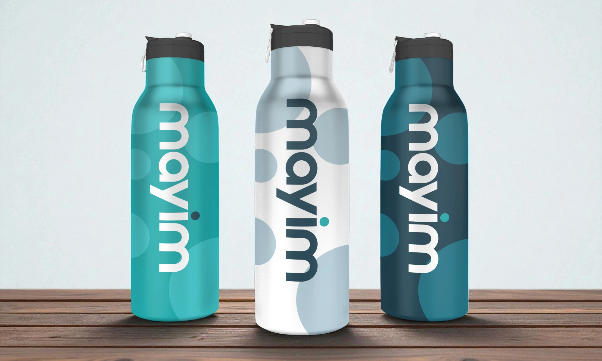
Color is one of the fastest signals your brand sends. Before someone reads your headline or clicks a button, they feel something based on hue, contrast, and overall harmony. That first impression can support trust, clarity, and momentum, or it can create hesitation.
At Ulisses – the creative powerhouse owned by award winning designer Uriya Ganor – we have spent 20 years helping brands build identities that work across cultures, devices, and real business goals. The key lesson is simple: color choice is not about personal taste. It is about meaning, usability, and consistency.
In this post, you will learn the practical side of color psychology in branding, how to avoid common palette mistakes, and how to build a system that works for both brand identity and UI UX design.
Build a Brand Color Palette That Communicates and Performs
A strong palette makes your brand easier to recognize, easier to use, and easier to trust. The goal is not to pick pretty colors, it is to pick roles and rules.
What Color Psychology Really Is
Color psychology is the relationship between color and perception. Certain colors often trigger similar associations because of culture, context, and repeated patterns in the world. Blue is frequently linked with stability and reliability. Green can suggest growth, nature, or health. Black can feel premium or authoritative. But color psychology is not a universal cheat code. The same color can signal different things depending on industry, saturation, contrast, and the surrounding palette. A bright red might feel energetic in sports branding but alarming in a healthcare app. That is why your palette must be designed as a system, not chosen as isolated swatches.
Start With Brand Strategy, Not Mood Boards
Your color palette should support your positioning. Begin with the promise you want customers to remember. Are you selling calm expertise, bold innovation, or friendly simplicity? Then consider your audience. What do they already trust in your category, and how can you fit expectations while still being distinct? Also define where your brand lives most. A digital first brand needs colors that perform on screens, in UI components, and in dark mode scenarios. A print heavy brand needs colors that reproduce consistently in real materials. Strategy comes first because it reduces endless debates later and keeps the palette aligned with business goals.
Understand the Role of Context and Category
Colors do not live in a vacuum. They live inside categories where customers already have expectations. Financial services often lean into blue and gray because they signal stability. Wellness brands often use greens and soft neutrals. Tech brands frequently use clean neutrals with a bright accent. You can follow category patterns if they match your strategy, but you should avoid blending in completely. The best approach is controlled familiarity. Keep one element that feels expected for trust, and introduce one element that feels unique for differentiation. This can be a distinctive accent color, a specific saturation level, or a signature gradient that becomes recognizable.
Choose a Palette Structure With Clear Roles
Most palettes fail because they are just a list of colors. Instead, assign roles. A practical palette usually includes:
-
Primary color for key brand moments and primary actions
-
Secondary color for support and variety
-
Accent color for highlights and emphasis
-
Neutrals for backgrounds, text, and layout
-
Feedback colors for success, warning, and error states
When you define roles, you protect consistency. Designers stop inventing new colors for every page, and developers can build tokens that scale. Your UI becomes clearer because primary actions look the same everywhere. Your marketing becomes more recognizable because key brand moments repeat in a consistent way.
Prioritize Contrast and Readability for UX
If your palette looks good but reduces readability, it will hurt performance. Many brands choose light gray text on white because it feels modern, but it often fails in real conditions. Contrast impacts accessibility and basic usability. Buttons need to stand out from backgrounds. Links must be recognizable. Text must be readable on mobile in bright light. When we build palettes at Ulisses, we test them on real layouts: navigation, forms, pricing tables, and call to action sections. We also test states like hover, focus, disabled, and error. Color is part of UX typography because it supports hierarchy. If hierarchy is unclear, users feel friction, and friction reduces conversion.
Avoid These Common Branding Color Mistakes
A few mistakes show up across industries:
-
Choosing colors based only on personal preference
-
Using too many saturated colors that compete for attention
-
Having no consistent neutrals, leading to messy backgrounds
-
Making the accent color the same as the primary action color
-
Ignoring product UI needs like error states and charts
-
Designing only for light mode and forgetting dark contexts
The fix is almost always a role based system and clear usage rules. When rules exist, creativity improves because the team is designing within smart constraints instead of guessing.
Build a Simple Process to Pick Your Colors
Here is a practical workflow you can follow:
-
List your brand traits in plain language, like confident, warm, precise
-
Collect competitor palettes and note what feels overused
-
Pick one direction for primary tone, like calm, bold, premium
-
Choose neutrals first, because they carry most layouts
-
Select a primary color that matches your promise and works in UI
-
Add an accent color that creates contrast and attention
-
Define feedback colors for success, warning, and error
-
Test on real templates and revise based on readability
This process keeps decisions grounded. It also prevents the common trap of falling in love with one color that cannot handle real UI constraints.
Make Your Palette Consistent Across Touchpoints
Brand consistency depends on repetition. Your palette should show up across web, social, email, slides, and product UI with the same logic. That does not mean everything must be the same shade everywhere. It means roles stay consistent. Primary actions stay primary. Neutrals stay neutral. Accent usage stays intentional. Document rules in your brand guidelines and connect them to templates. If your team uses a design system, convert colors into tokens so they are applied consistently in code. The goal is to make the right choice the easiest choice, which reduces drift over time.
Use Color to Support Story and Conversion
Color can guide attention. Use it to reinforce hierarchy, not to decorate every element. A common pattern is to keep most layouts neutral and reserve the strongest color for the key action or message. This makes calls to action more visible and reduces cognitive load. In storytelling sections, color can also separate ideas. A different background shade can signal a new chapter, like moving from problem to solution. In UI, color can clarify state, like showing errors clearly and success without ambiguity. When color supports meaning, it supports conversion because users feel guided, not pushed.
Color is one of the few brand tools that people recognize instantly and remember subconsciously. When you build your palette as a role based system, test it for readability, and document usage rules, your brand identity becomes clearer and your UX becomes smoother. That clarity shows up as trust, and trust shows up as action. If you want a palette that works across branding, web design, and product UI, Ulisses can help you define the strategy, design the system, and document it so it stays consistent as you scale – led by Uriya Ganor and backed by 20 years of global brand work.