A landing page is not a miniature website. It is a focused experience with one job: move a visitor from interest to action with as little friction as possible. When landing pages underperform, the problem is rarely the button color. It is usually unclear intent, weak hierarchy, missing trust, or too many competing messages.
At Ulisses – the creative powerhouse owned by award winning designer Uriya Ganor – we have spent 20 years designing brand driven pages that convert across industries and markets.
This post breaks landing page UX into simple, practical decisions you can apply immediately, whether you are running paid traffic, building SEO landing pages, or launching a new offer.
A Landing Page UX Framework You Can Reuse
The best landing page UX feels obvious. Visitors instantly understand what you offer, who it is for, and what to do next. Use the framework below to structure the page, write clearer content, and design an interface that supports confidence.
Start With One Intent, Not Five Goals
Every landing page should match a single intent. If a visitor arrives from an ad about a free audit, the page should not also push a newsletter, a webinar, and a demo. Choose one primary action and make everything support it. Secondary actions can exist, but they must be visually quieter and placed after the page has delivered value.
A simple test is this: if you had to summarize the page in one sentence, could you do it without using the word and? If not, the page is trying to do too much, and users will hesitate.
Make the First Screen Answer Three Questions
Above the fold is not a fixed pixel height. It is the first impression zone. Your first screen should answer:
-
What is this?
-
Is it for me?
-
What happens next?
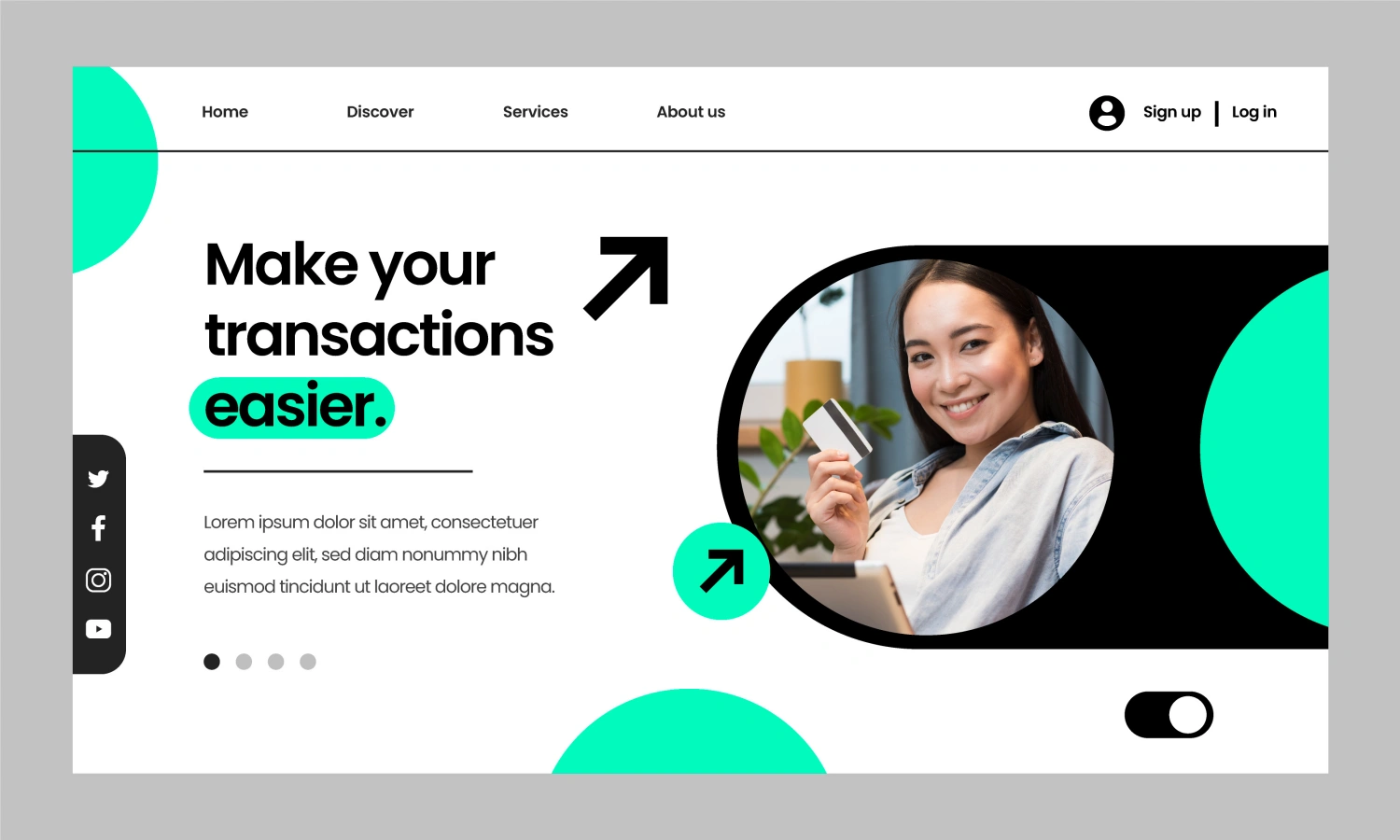
Do this with a clear headline, a short supporting line, and a primary call to action. Add one strong visual that reinforces the offer, not a decorative hero image. If the offer is complex, use a simple explainer line that translates it into outcomes, like reduce onboarding time or improve conversion rate. Landing page UX improves when users do not have to interpret what you mean.
Use a Value Proposition That Feels Specific
Generic claims like best in class and innovative solutions do not reduce risk. Specific outcomes do. Instead of saying we build better websites, say what better means: faster load time, clearer navigation, higher lead quality, fewer support tickets, or higher checkout completion.
If you are unsure how to make it specific, borrow language from customers. Use phrases from reviews, sales calls, and common objections. When a page sounds like the visitor, trust increases. This also helps SEO because the wording matches real search queries and user intent.
Build a Visual Hierarchy That Guides the Eye
A strong hierarchy is the backbone of landing page UX. Users scan in patterns, and your design should guide them through a story:
-
Promise and action
-
Why it matters
-
How it works
-
Proof
-
Details and objections
-
Call to action again
Use typography scale, spacing, and contrast to make the path clear. Keep the primary CTA visually dominant and consistent. If the CTA changes from Get Started to Learn More to Book a Call, users pause to evaluate, and evaluation slows conversion.
Reduce Choice and Increase Momentum
Friction often hides in small choices. Too many options, too many fields, too many links, and too many messages create cognitive load. Simplify:
-
Keep navigation minimal or remove it on paid campaign pages
-
Use one primary CTA style and one secondary style
-
Limit form fields to what you truly need now
-
Move extra details into expandable sections or FAQs
Momentum is also emotional. Use short sections, scannable bullets, and clear transitions so the page feels easy to finish. Long blocks of text without structure make visitors feel like the page will take work.
Place Trust Where People Feel Risk
Trust is not a footer section. It is a pattern across the page. Add trust signals near the moments of decision, especially near the first CTA and near the form. Good options include:
-
Client logos or recognizable partners
-
Short testimonials that mention outcomes
-
A clear process overview
-
Security and privacy notes for forms
-
Guarantees, trial terms, or cancellation clarity
If you sell premium services, show expertise without sounding defensive. Mention awards, years in business, or a simple credential, but keep it connected to value. Ulisses often uses concise proof that matches the promise, like a measurable outcome or a specific type of client challenge solved.
Write Copy That Matches How People Actually Read
Landing page copy should be easy to scan. Use short paragraphs, descriptive subheads, and bullets that start with verbs. Avoid clever intros that delay the point. Visitors want the result first, then the reasoning.
A helpful structure for each section is:
-
One sentence claim
-
One sentence explanation
-
One proof point or example
For tone, keep it confident and friendly. Overly formal language can feel distant. Overly casual language can feel risky. The best landing page UX copy sounds like a clear conversation with a knowledgeable team.
Design the CTA Flow, Not Just the Button
Calls to action work when the path feels safe. Make the CTA language specific and aligned with the offer, like Get the Checklist or Book a 15 Minute Call. Support the CTA with microcopy that reduces worry, like No spam or Takes 2 minutes. Keep the form experience clean, with clear labels, inline validation, and obvious error messages.
If you are using a multi step flow, show progress so users know what is left. If you are asking for a phone number, explain why. Small explanations often remove the exact hesitation that stops conversion.
Optimize for Mobile as a Primary Experience
Most landing pages are reviewed on desktop and used on mobile. That gap causes problems: cramped spacing, tiny tap targets, and forms that feel exhausting. Mobile landing page UX should prioritize:
-
Larger text and comfortable line height
-
Clear spacing between sections
-
Buttons that are easy to tap
-
Sticky CTA bars only if they do not block content
-
Short forms with autofill friendly fields
Also check performance. Heavy images, too many fonts, and large scripts slow the first meaningful paint, and slow pages lose users before the message lands.
A Quick Landing Page UX Checklist
Use this checklist before you publish:
-
One primary intent and one primary CTA
-
First screen answers what, who, and next
-
Visual hierarchy guides a clear story
-
Proof appears near decision moments
-
Copy is scannable with strong subheads
-
Form is short, labeled, and reassuring
-
Mobile layout is comfortable and fast
-
Analytics events track the CTA and form completion
Landing page UX is not about tricks. It is about removing uncertainty and making the next step feel natural. When the message is specific, the hierarchy is clear, trust is placed strategically, and the mobile experience is smooth, conversion becomes the outcome of clarity. If you want landing pages that reflect a strong brand identity while performing like a focused funnel, Ulisses designs and builds conversion driven experiences guided by Uriya Ganor, with a process refined through two decades of global client work.